Your online portfolio is the portal through which both clients and readers learn about you and your work — and one of the best ways to land writing jobs.
That means that, for many of us, creating a writer website is hugely intimidating. I put off creating a writer website for months simply because I didn’t know how I wanted to put it together.
Luckily, you have options. There are as many types of writer websites as there are writers, and you don’t have to make your writer website fit any kind of preconceived template or mold.
Instead, use your online portfolio to reflect what makes you unique as a writer, and what you have to share with clients, readers and fans.
Need inspiration? Check out these online portfolio examples
Don’t make the mistake of thinking that creating your online portfolio has to be a massive project. We’ve showcased lots of portfolio websites that make it easy for you.
But before you build your own, we’ve got some inspiration to get you started! We found some solid writer websites to share, each with a unique focus and design.
Here are 17 online portfolio examples.
1. Elna Cain
Elna Cain’s writer website is bold, partly because she blatantly tells you she’s the freelance writer your business or project needs. To further convince you, a row of prominent publications are listed right above her introduction — that’s where she confidently states the problem clients have and how her skills can it. Then, the page ends with glowing client remarks.
Elna’s online portfolio shares a variety of ways to get in touch with her for business opportunities and how to keep up with her work online. To assert her expertise in the field, Elna also links her popular blog that’s filled with tips on how to make money with writing.
Manjula Martin’s site is a great example of a basic, straightforward online portfolio: a brief introduction with her resume highlights front-and-center, and lots of links to connect people who want to learn more. She built it on WordPress.
Manjula’s website works because you learn everything you need to know about her credentials and writing style at a single glance. It’s easy to follow the links and read her clips, and she also gives you many ways to contact her with writing or consulting opportunities.
3. Ann Friedman
The first thing you notice on Ann Friedman’s website is how it brightly displays her logo, followed by a row of links to her completed work, newsletter and contact information. Talk about a simple and beautiful landing page!
The rest of this writer website contains plenty of unique touches: a general FAQ plus one for her newsletter; a page of various creators, content and organizations she recommends; a thorough contact page; and creatively-titled side work that highlights even more skills beyond her stellar portfolio of work for tons of household brands. There’s no question about who Anne is, the service she provides and how to reach her — this is the goal for all writer websites.
It’s possible to create an extremely compelling writer website without a single photo, logo, or image. Nozlee Samadzadeh’s site lists her contact information, concise explanations for her professional experience, and links to her publications, all on a single page.
Nozlee’s site also includes a short statement of her “primary beats,” which is key info for anyone looking to hire her for a writing job.
Seanan McGuire’s writer website instantly immerses you into her urban fantasy world. Her latest release is prominently featured, and the header image and colors help establish her genre to new visitors. The left-hand navigational column provides easy access to important information.
If you write fiction, especially genre fiction, let your writer website reflect your fictional worlds. Open the door to your fiction by giving readers the chance to see what might be hidden within the pages.

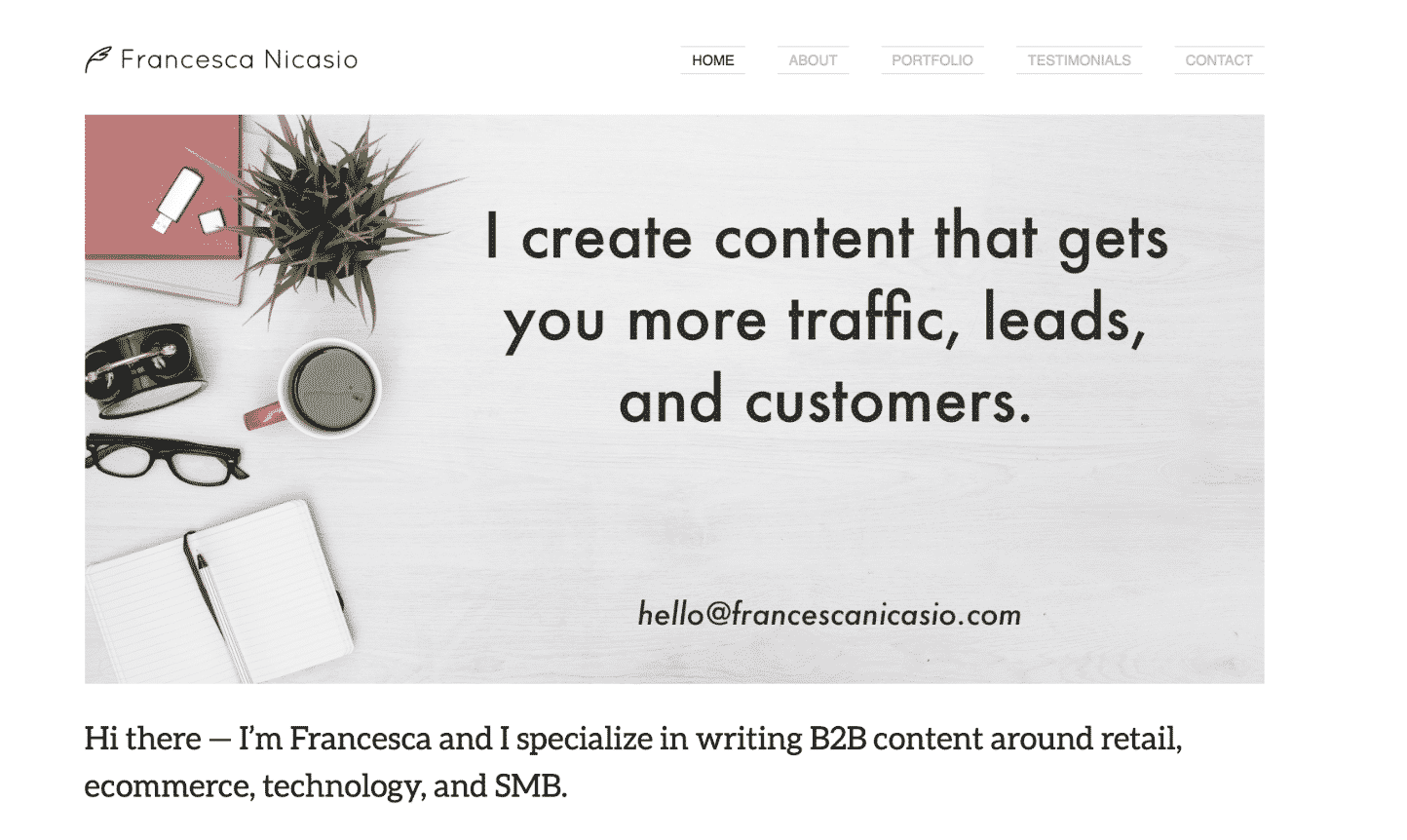
Copywriter Francesca Nicasio’s writer website aptly showcases her expertise in writing B2B content around retail, eCommerce, technology, and more. The entire website is structured around one goal: informing readers about her capabilities the very moment they get to her site.
What’s the goal of your writer website? Are your skills and services clearly explained? When users visit your site, do they know what to do if they want to work with you? With her email address displayed largely on the front page, Francesca makes it easy for clients to get in touch with her. Your writer website should do the same.

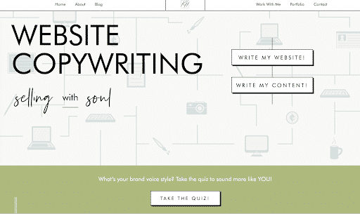
“Inviting” is the best way to describe Kayla Hollatz’s writer website. The big, bold words that immediately greet you are enticing enough to make you want to keep exploring her trendy online portfolio. And without needing to scroll too far, Kayla’s concise and effective introduction appears, placed evenly below a prompt to take her brand style quiz.
Wherever you go, Kayla’s writer website accomplishes one major thing: She pulls you in by subtly emphasizing her savviness. From spelling out the details of how you’ll work together to sharing impressive client success rates, it’s evident this writer knows her stuff — and she wants you to learn it, too, hence her quiz and email course.

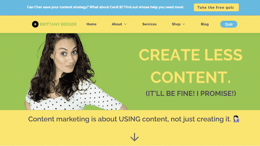
How often are you intrigued by an unpopular opinion? Probably almost always, because, well, you just have to find out how you could possibly be on the wrong side of the truth. That’s what’s awesome about Brittany Berger’s approach to her writer website — she offers a solution most companies think is the problem.
Her conversational tone guides you into understanding her logic, and she offers a number of valuable resources to help you learn about being mindful about content creation, and how to be more productive as you do.
She created her website on WordPress.
9. Sarah Turner
Sarah Turner’s writer website is one of those slick, beautifully designed sites that intimidate the rest of us. It’s the type of site that looks like it requires the assistance of a web designer, which means it’s aspirational for a lot of us, especially those of us who are just getting started as freelancers. In actuality, Sarah’s website was created with the help of WordPress and Themely.
However, design isn’t the only aspect that makes Sarah’s writer website great. Her opening sentence clearly highlights her writing niche, how she can use her skills to improve your business in the health industry — the key goal of any resume or website — and includes a direct call to action.
You can include a similar paragraph and call to action on your own writer website; no design firm required.
10. Kat Boogaard

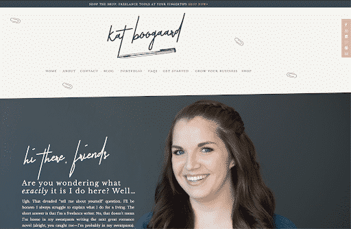
Freelance writer Kat Boogaard leads with an authentic and friendly voice on her writer website — one that makes you feel like you’ll hit it off with her right away. Amid a fresh and sleek design filled with calming neutral colors, she shares brief paragraphs about who she is, what she writes for clients and how she can help freelance writers grow their businesses.
Kat’s conveniently-placed menu at the top and bottom of her website is easy to navigate, but one thing I love about her website is how you can find your way around her site without it. As you scroll through the homepage, you’ll find that she takes you from one valuable resource to the next, all without making you feel bombarded.
11. Helen Gebre

This writer website gets one important thing down pat: You can feel how much Helen Gebre loves the art of writing. She also does this very simply, through an introduction and biography that gives you a glimpse into her personal life, her career and why she does this work.
Helen’s website design is simple, likely because she has a diverse portfolio featuring big and bold copywriting decks that span across print and digital writing, social media, video scripts and more. Besides a contact page, she also cleverly set up her phone number as the footer on each page — that way, clients viewing her page know how to reach her immediately.
12. Chidinma Nnamani
Clients visiting B2B writer Chidinma Nnamani’s page learn right away what her expertise is. Throughout her writer website that she designed with WordPress and Elementor, she clearly articulates her skill and experience with B2B writing for the tech, food and digital marketing industries.
Besides a clean website design that reflects Chidinma’s design aptitude, her inclusion of a robust services page and a page that details her four-step process for working relationships provide a peek into her professionalism and organizational skills. One more thing to note from this writer website? The frequent “Ready to hire me?” prompts displayed throughout the site!
13. Sarah Asp Olson
Before you learn about this writer, you first take a tour of her impressive writing clips, which progressively leads you to where you can learn more about and reach out to her.
One of the best parts of designing your writer website is all the creative ways you can display your work. Each website on our list brings their own flair to their portfolio, and Sarah Asp Olson is no exception in the way her site only features the content she’s created. Like she does, you can use bright, colorful images that capture the eye to separate the industries you write for. Then, display your samples in bulleted lists, or in rows of hyperlinked thumbnails.
Remember there are no rules to how you organize your work — just ensure it’s clear, and easy to navigate.
14. Samar Owais
What should people learn about you as soon as they visit your writer website? For writer Samar Owais, potential clients find out immediately she can increase conversions and boost sales — and her speedy acknowledgement of these skills and her niche can make a difference in how quickly visitors leave her site.
Throughout her writer website, Samar features client testimonials and a valuable email marketing quiz. Additionally, she makes her expertise clear through brief, compelling descriptions that outline how she solves conversion issues as an email conversion strategist and SaaS copywriter. And if anyone wonders why they should work with her, she makes convincing arguments for that, too.
15. Muriel Vega
Don’t you just want to click those icons? That’s the power of color and fun design animation! Atlanta-based writer and editor Muriel Vega’s writer website has a simple design layout, but that doesn’t stop the sense of her personality from seeping through as you learn about her through projects and writing samples.
This site is a great reminder that you don’t have to overwhelm your writer website to make an impact — consider who you want to attract, and incorporate engaging design elements that reflect your creativity.
16. Tyler Koenig

Copywriting expert Tyler Koenig has a writer website that feels extremely confident and laid-back. Within a well-designed website that tastefully centers the color orange (maybe for basketball?), Tyler provides heaps of value through his email list, webinars, courses and free tips through his blog.
“Become your own most trusted copywriter,” he writes on the landing page of his self-paced copywriting courses, which successfully expresses his earnest desire to share his passion to help others grow. Besides that, providing free and paid resources truly highlights your expertise to prospects.
17. Nicole Dieker (yes, that’s me!)
My writer website serves two purposes: It’s a place where people can learn more about my freelance and teaching work, and it’s also a blog that focuses on the art and finances of a creative career. I include “where I got published this week” roundups every Friday and finance roundups on the first of every month, along with daily insights on work-life balance, how to earn money for your creative work, the process of writing a novel and more. I also pay writers for guest posts, so pitch me!
I set up my site through WordPress using a pre-designed template.
Do you have a writer website you’re proud of, or are you working on one now? Share your experience with us in the comments!
This is an updated version of a story that was previously published. We update our posts as often as possible to ensure they’re useful for our readers.
Photo via Zofot/ Shutterstock
The post An Online Portfolio Can Change Your Career: 17 Writer Websites We Love appeared first on The Write Life.
Read more: thewritelife.com
