
Great design doesn’t just happen, and stunning design deserves to be celebrated. Each year the 99awards shine a spotlight on the incredible creativity that comes from the platform and gives major props to our gifted global community.
Last year we brought in our first ever jury of design professionals to weigh in on your work. And we’re doing it again this year, introducing you to some fresh talent while we’re at it.
Our 2020 panel is an inspiring bunch from all industries and walks of life (psst, Squarespace and Packlane)! We think you’ll love them as much as we do. Read on to find out how they fell in love with design, plus their best tips for successful creatives.
Ready to be wowed?
Take me straight to the nominees.
Let’s go!
The 2020 jury
Andrea Pippins | Print
Allison Filice | Illustration
Charlie Smith | Branding
Satu Pelkonen | Digital Design
Miriam Brafman | Packaging
Will Paterson | Typography
Andrea Pippins
—
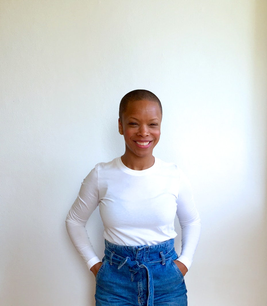 Celebrated author and illustrator Andrea Pippins weighs in on the Print category
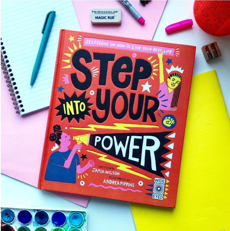
Andrea Pippins creates images that celebrate different standards of beauty. Her work explores ideas of empowerment for women and girls and highlights visual stories that are often overlooked. Her illustrations have been published in Communication Arts, The Huffington Post, and The O Magazine. With her celebratory and vibrant style, she hopes to inspire others to explore various forms of creative expression.
How and when did you get involved with the work you do today?
Working for myself as a full-time illustrator/designer is something I wanted to do for a long time. I had been working for several companies, like Hallmark Cards and TV Land/Nick@Nite, before moving on to teaching design courses full-time as an assistant professor. I was also doing a lot of freelance work on the side: art commissions, branding, and illustration. In one job I got to work with amazing colleagues and young people, and in the other I had total freedom over my creative endeavors. But then it got a little crazy.
My schedule was very intense with trying to manage both workloads. I finally realized doing both was not sustainable. In 2014 I made the decision to work for myself full-time and made the leap in 2015. That year I was offered my first book deal, which opened the doors for more illustration projects and then writing.
Reflecting on the past year, what notable design trends have you noticed? What do you hope will take off?
I’ve been seeing artists experimenting with animation and VR in unexpected ways (check out the work of Aurélia Durand).
Fun and unique collaborations between artists and big brands is something I’ve been seeing more frequently, like Camille Walala and her recent collaboration with Lego to launch their new product, or Lisa Congdon’s collaboration with Comme Des Garçon. Brands are understanding more and more the added value of working with artists outside of their companies as a way to bring a fresh perspective to their product or service, which can improve the end-user’s experience.
The visual memoir trend is really taking off for illustrators. Awesome examples are Jordan Sondler’s Feel it Out and Belonging by Nora Krug. Both books use illustration and hand-lettering to share experiences of self-discovery. The way they play with storytelling by bringing in the text into the image in the form of diagrams, lists, iconography, is quite beautiful. I’m really excited about this trend because I think it opens doors for illustrators and how they tell stories.
When it comes to a printed piece, what really impresses you?
After being drawn to the piece by color, material, or image, what really impresses me is the content. What is the story or message being conveyed and is it captured in a way that makes me stay, and then walk away still thinking about what I had just seen?
What’s your best piece of advice for aspiring creatives?
Keep practicing your craft, take classes and go to the library, and give back through mentoring, teaching and writing.
Check out the nominees for Best Print Design →
Allison Filice
—
 Meet illustrator Allison Filice
Allison Filice is a San Francisco-based creative whose ‘friendly-psychedelic’ illustrations colorfully explore her inner and outer worlds. She counts The New Yorker, WSJ, Refinery29 and The New York Times among her many clients.
Tell us about your design journey
I studied graphic design in college and worked in the industry as both a graphic designer and user experience/user interface designer. About three years ago I felt a calling to make a change and I left the design world to pursue illustration full-time. I really needed to have more self-expression in my work, and I realized I could explore that through the medium of illustration.
And if you know you have something important to share with the world, then you have to give it a shot.
– Allison Filice
It took a while to rebuild my career and it was quite a journey into self-discovery as well, but eventually I got some editorial commissions, and those built upon each other and I got more work. Eventually things just started to click.
What emerging editorial illustration trends have you noticed?
At the style level I’ve noticed a lot of beautiful airbrush artists emerging. That’s part of a larger wave of illustration feeling more analog, more abstract, and New-Agey/psychedelic.
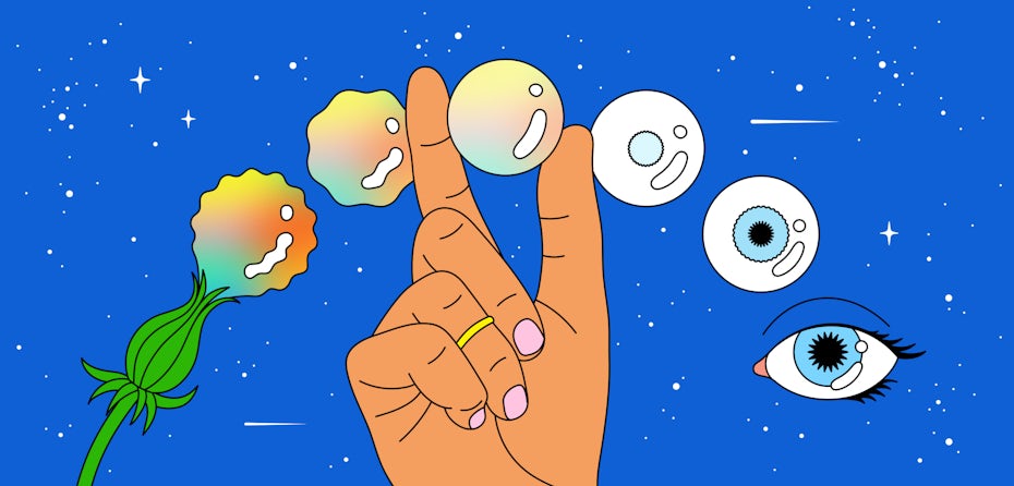 Cosmic Flow via allisonfilice.com
When it comes to design, what really impresses you?
I love when an artist has a message to share with the world. When what they’re creating goes beyond skill and style, and they’re tapping into something deeper within them. Something that other people can see themselves in and feel more whole and connected because of it. Almost like a song you can really connect with, but in a visual sense.
What’s your best piece of advice for aspiring creatives?
Start your journey now. Even if you just commit to doing something for ten minutes a day. You have to start sometime, and you have to do a lot of work to find yourself and your style. Some of that work won’t be great, but you have to move through that to emerge in a place where you’re attracting the clients or the audience you want. It can be scary to start taking steps, but you’ll look back in a year and be so thankful you got started.
Be inspired by the nominees for Best Illustration Design →
Charlie Smith
—
 Charlie Smith brings the branding expertise
How and when did you get involved with the work you do today?
I’ve been doing it for a long time. Graduating 20 years ago from Glasgow School of Art, then working at Pentagram and NB:Studio, and then setting up a graphic design studio 17 years ago. Today we work in a variety of sectors, including hospitality, culture and arts and retail. Many of the clients we start working with come to us through word of mouth and then become repeat clients, so we often work with companies for quite a few years.
What branding trends have you noticed pop up in the last year?
A lot more motion is being used in identities—specifically logos and key visual assets—which is both exciting and very engaging. But can end up being a bit too tricksy and sometimes feel overused, especially when not entirely appropriate for the company. Variable type is quite exciting and potentially a bit of a game changer, it is exciting to see this new technology.


When it comes to branding, what really impresses you?
As designers we’re surrounded by beautiful visuals, and it’s easy to be overly influenced by the latest trends. Whether it be typefaces, colour palettes, image style, patterns etc., it’s easy to absorb these styles into one’s work. As a result so much design is becoming homogeneous, so a visual identity for a cosmetics brand can look the same as a restaurant.
What really impresses me is when a design is fit for purpose and not just a stylistic choice. When it doesn’t follow the latest fad. When there’s an idea running through it, and it’s that idea that’s dictated the ultimate visual outcome.
Do you have any advice for designers wanting to break into the agency world?
Do your research, hunt out agencies you’d love to work for. When you’re getting in touch, mention projects you especially like of theirs. It shows you’re interested and engaged. A portfolio should look well put together, but an agency will care more about the ideas and the way you think, rather than the most highly polished portfolio.
I would avoid creating a logo for yourself as you’re not a brand, and don’t do infographics of your abilities in the software. I think it undermines a good portfolio. I’m more interested in seeing a more in-depth project, perhaps a self initiated project stemming from a real interest. I’m interested in hearing about the motivations, research, ideas behind the finished outcome.
Be wowed by the nominees for Best Branding Design →
Satu Pelkonen
—
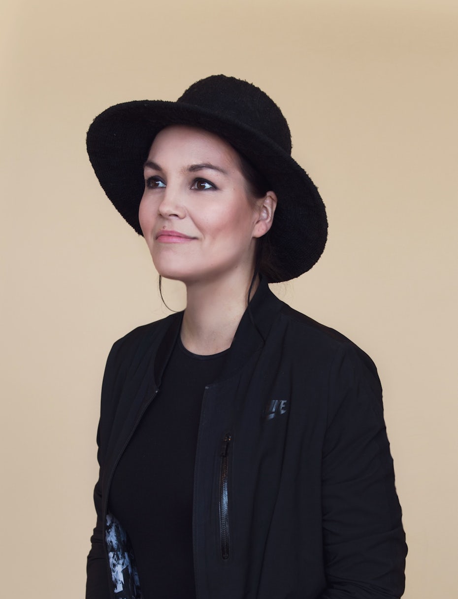 Satu Pelkonen is a digital design guru
Satu is a Sr. Design Manager for Squarespace. Her primary role is leading the design efforts of the Brand Design team. Prior to joining Squarespace, Satu spent over four years at Stink Studios New York overseeing the creative efforts as a Design Director leading brand redesigns, web experiences and advertising projects with a range of clients such as Google, Spotify, Sony, Twitter, Facebook, COTY and Chevrolet. She has been honored with accolades from industry awards programs, including Cannes Lions, D&AD, One Show, and The Webbys.
Tell us about your design background
I studied graphic design and engineering, so combining tech and design was something that always intrigued me. It was at a time when Flash was huge and web design was becoming a thing, so I was passionate about learning everything I possibly could.
I was lucky enough to work in some of the best digital agencies in Finland, but I always had the passion to go abroad. In 2014 I moved to New York to work at Stink Studios, and spent five years working on everything and anything digital and design-related you could imagine—while also leading the creative team as a Design Director.
After my time at Stink I wanted to try something different, and I’d heard great things about the internal creative team at Squarespace. This March marks my 1 year anniversary here, and it’s been amazing to see what high-caliber work our internal creative team produces.
Reflecting on the past year, what emerging web or digital design trends have you noticed?
Typography is taking over in web-design. It’s such a huge part of creating beautiful layouts, so it’s been really exciting to see more playfulness with type more recently.
When it comes to on-screen design, what really impresses you?
I love when people combine color, type and photos and empty space in a way that everything just sits perfectly together. Sometimes people get too hung up on fine-tuning the small details when the big picture isn’t fully in place yet. The small interactions and delightful animations will just be the icing on the cake once you’ve managed to nail down the bigger picture.
I’m a big sucker for type. When people are playful but intentional with their use of typography—that always gives me great joy.
– Satu Pelkonen
Do you have any advice for designers wanting to break into UX/UI, or digital design in general?
There’s a ton of things you can learn on the internet nowadays through online resources, courses and tutorials and you really don’t necessarily need an expensive design degree to get into digital design.
What makes digital design different from traditional graphic design is the tech side of things, and I think having an understanding of the technical limitations of digital design and at least a basic understanding of HTML and CSS is always helpful if you want to get in the field.
Check out the nominees for Best Digital Design →
Miriam Brafman
—
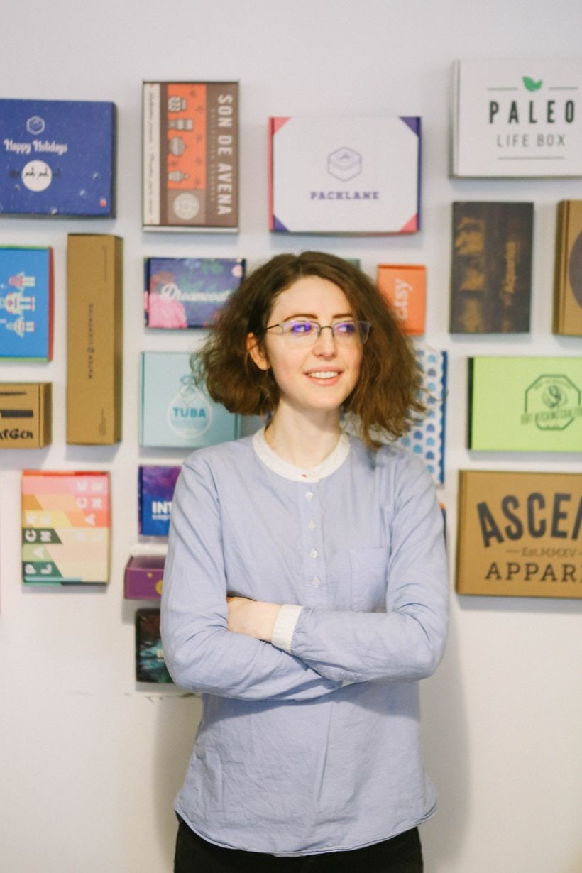 Miriam Brafman defines creative entrepreneur
Miriam Brafman is the founder and CEO of Packlane, an online printing company that makes it simple for businesses to design custom packaging online. When she built the company in 2015, there were no opportunities for designers like herself to create beautiful custom packaging in small volumes. Seeing a need in the market and with ample design inspiration under her belt, Miriam launched Packlane. Since then, Packlane has provided packaging solutions for over 35,000 clients of all shapes and sizes.
How and when did you get involved with the work you do today?
I fell in love with graphic design in high school and was always inspired by beautiful packaging and the magical wonders it worked making people fall for an unknown product. This led me to found Packlane.com when I was a designer struggling to find a good solution online for designing and ordering custom packaging. Since then I’ve been focused on leading the company to fulfill our mission of democratizing and demystifying the packaging process for tens of thousands of brands.
What emerging packaging design trends have you noticed?
There’s so much incredible vintage design inspiration and color palettes to mine on the internet, and a lot of brands are incorporating these elements into their packaging design in order to stand out. Designers are wanting to portray a timeless look and feel, with heavy usage of serif fonts, and the most effective designs are mixing a good balance of the past with nods to the present.
Throwback and retro packaging that evokes nostalgia is having a big moment.
– Miriam Brafman
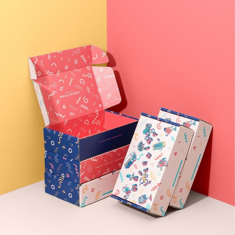 via Packlane
When it comes to packaging, what really impresses you?
I’m always impressed when a combination of impressive engineering and structural design gets combined with beautiful graphic art—whether that’s illustration and/or typography.
What’s your best piece of advice for packaging designers?
Packaging is an amazing canvas for creativity. The more you understand about the materials, manufacturability, cost considerations, finishing options, and printing science behind the world of packaging, the better you can create holistic and successful solutions for customers that go beyond just an aesthetically appealing container.
Be stunned by the nominees for Best Packaging Design →
Will Paterson
—
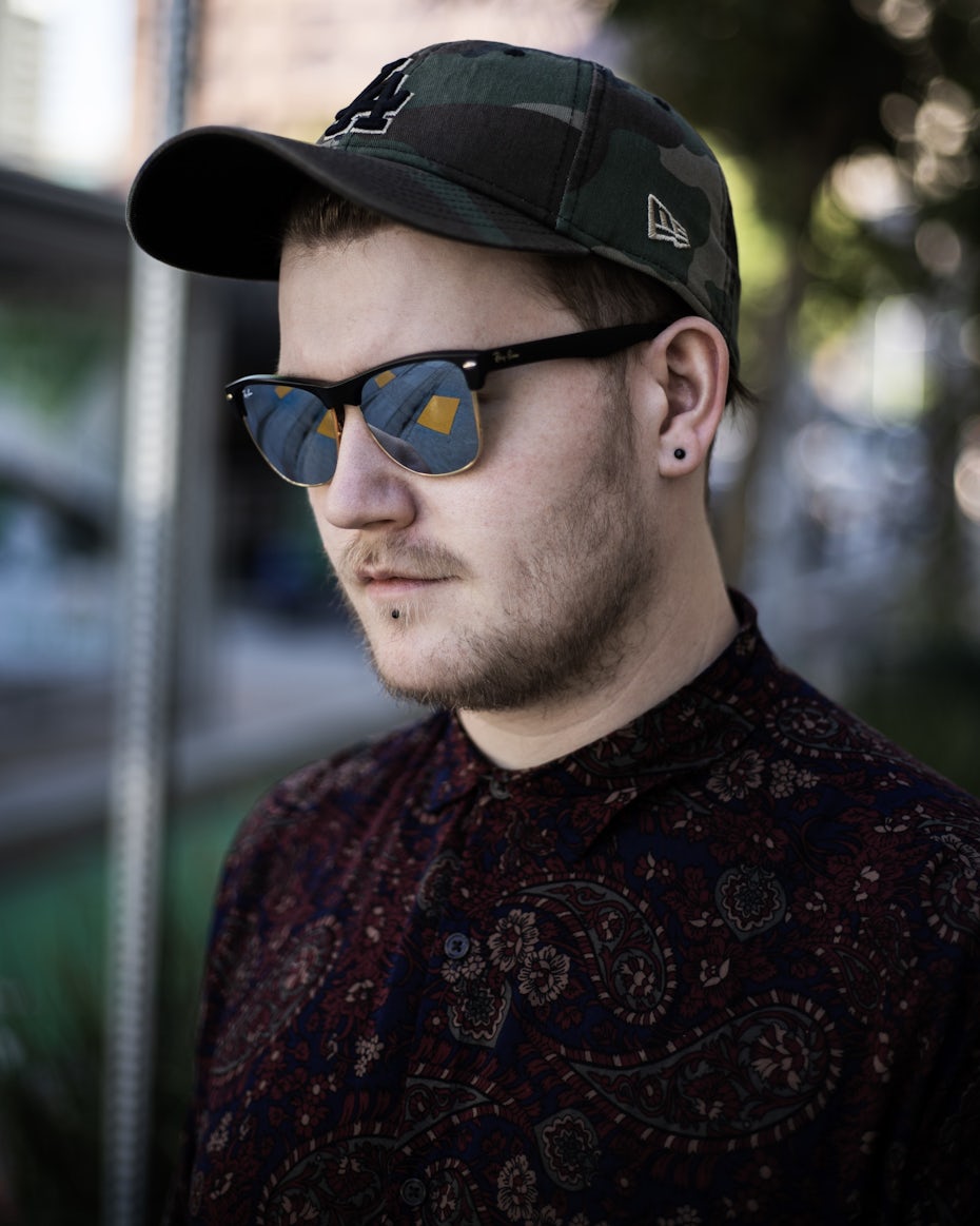 Will Paterson knows a thing or two about hand-lettering
Will Paterson is a UK-base logotype designer, educator, Youtuber and author. He creates bespoke logos and brand identity systems for businesses across a variety of industries. Oh, and letters are kind of his thing.
How and when did you get involved with the work you do today?
I got involved with design when I was 17—I stopped going to college to pick up my passion full time. I started posting Adobe Illustrator and Photoshop tutorials on YouTube, where it then evolved into teaching about my design career and everything else in between to help freelancers and creatives.
What hand-lettering trends have you noticed pop up in the last year?
Interesting composition is a given—but nature based typography is beautiful. Applying effects to your lettering or even just balancing your composition always gets a double take and interest from me.
Do you have any advice for aspiring hand-lettering designers?
Never stop learning, never stop teaching. Whatever you learn make sure you teach others – share the love! Teaching is another way to generate income and to further build your personal brand. Don’t just look to client work, always teach!
Fall in love with the nominees for Best Typography Design →
The post Meet the 2020 99awards jury! appeared first on 99designs.
Read more: 99designs.com

 via
via