

To reach the right audience, each 2020 presidential candidate’s logo and branding needs to convey their individual message. Why? Because politicians depend on the same branding and graphic design techniques that businesses do. Great branding can play a decisive role in convincing voters and telling a persuasive, engaging story through logos, typography, color and content.
So what’s at work in the US presidential candidates’ logos and branding of the 2020 election cycle? With the widest range of different platforms and ideas among Democratic primary contenders (not to mention they’re competing against one of the most controversial incumbent presidents in history)… a lot is happening.
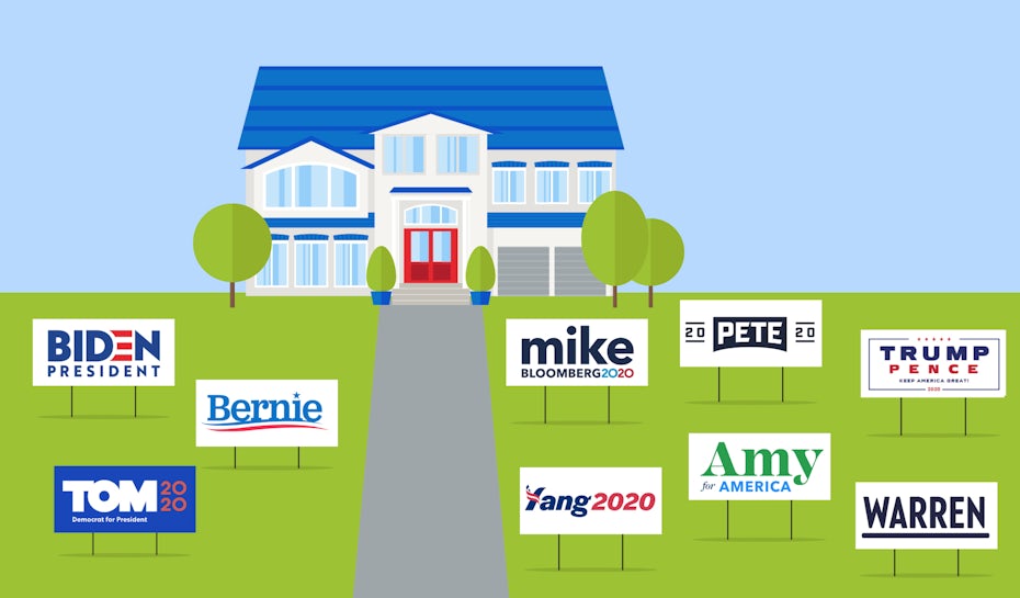 Illustration by OrangeCrush
Here’s our detailed analysis of the top presidential candidates’ branding for 2020—from their logos to their personality to their visual style.
The Candidates:
Joe BidenBernie SandersElizabeth WarrenPete ButtigiegMichael BloombergAmy KlobucharAndrew YangTom SteyerDonald Trump
Joe Biden
—
Brand colors: Vibrant red and white, dark and light bluesTypography: Bold and blocky, sans serifVoice: Hallmark-esque inspirationalSlogan: “Our best days still lie ahead.”
Want a return to old politics? Call Joe! Want a middle-of-the-road unifier? Call Joe! Want a candidate whose branding plays it safe and takes no chances? Call Joe!
![]()
Joe Biden, career politician and former Vice President, brands himself as the “candidate next door.” It’s in his very name: “Joe,” not “Joseph” or even “Biden.” He prefers to go by his nickname intentionally, as evidenced by his website tabs “Joe’s Story” and “Joe’s Vision,” a strategy also favored by Mike, Pete, Bernie and Tom.
His down-to-earth style is what made him so popular in the Obama era (though his critics are quick to point out that this is no longer the Obama era). He’s a people’s president, a guy you could have a beer with.
 Via joebiden.com
His visual style is traditionally political, using the color scheme of the American flag, a design that’s echoed without subtlety in his logo. No muted colors, though. Bold reds and whites complimented by both light and dark blues show strength and fearlessness. The typography, too, goes straight down the middle with sturdy and straight fonts that are softened without the serifs.
The voice of his campaign brand is optimistic and inspirational, a page out of his old Obama campaign book. That’s not to say he ignores the issues or pretends they don’t exist. Biden discusses the current troubles in the U.S. openly, but folds them into his brand’s theme of “strength in adversity.”
 Via joebiden.com
The Biden campaign (or the “Joe” campaign) seeks to appeal to the bell curve at the center of the political spectrum, but can’t afford to alienate the powerful progressive left. To do that, his branding style attempts to appeal to everyone, while taking bold stands when he can to avoid appearing pandering.
Bernie Sanders
—
Brand colors: Red, white and two shades of blueTypography: Informal serifsVoice: Your elderly but clever uncleSlogan: “Not me. Us.”
If you don’t know Bernie Sanders’ platform, you might mistake him for another Biden clone: the red-white-and-blue color scheme, the logo reminiscent of a flag. But when you read the fine print of his policies you see just how different he is. His branding actually plays it a lot safer than he does.
![]()
Except for the occasional jab at billionaires and the wealthy class, Bernie (who uses just his first name, too) has developed a visual brand that doesn’t take many risks. It’s almost contradictory to his message, but perhaps it’s intended to “soften” his progressivism and make him more appealing to moderates, a strategy that seems to have been successful. Thanks to his campaign’s steady and continual rise and popularity (a “Slow Bern,” if you will) this candidate who was once thought to be unelectable for his bold ideas has since risen in the ranks to tie for first with Biden, with some polls even putting him ahead.
 Via
Via Like his visual style, the voice for the campaign remains typical and traditional, betraying his age. But instead of giving general promises and vague sound-byte answers, Bernie’s campaign, more than others, integrates policy into their brand identity. The most obvious example is the campaign’s embrace of Bernie’s tentpole policy, “Medicare for all,” which is plastered on much of his merchandise and repeated on his social media, often filling the space where other candidates would have their slogan.
 Via @berniesanders
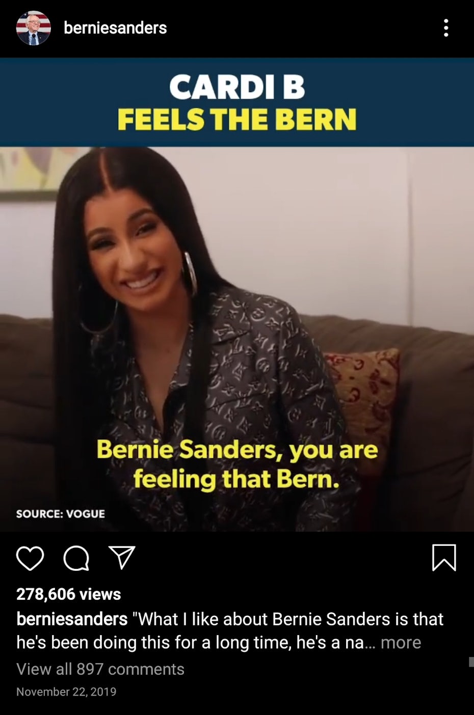
Where the Sanders campaign truly excels, and where it’s always excelled, is in outreach. He has a natural knack for getting his message heard and inspiring supporters by the millions. Perhaps it’s because his platform attracts a certain niche that’s easy to target, or maybe his staff just understands digital communication more than others. Either way, his “anti-billionaire” message has made him some powerful enemies, even affecting how the media covers his campaign.
To compensate, Bernie relies on alternative methods of reaching supporters. His social media accounts, which have the most followers by far out of all the Democratic nominees, target younger voters with humor, video clips and celebrity endorsements. True to his slogan, the Sanders campaign goes out of its way to show transparency and bring his fans into the behind-the-scenes happenings, strengthening the grassroots support he relies on.
Elizabeth Warren
—
Brand colors: Dark blue, light blue, white with red accentsTypography: Bold and blocky, sans serif (**face palm**)Voice: Iron-willed teacherSlogan: “Dream big, fight hard.”
One of the top Democratic contenders, Elizabeth Warren comes across as smart and precise, and her branding campaign fits like a glove. More so than campaigns of her rivals, Warren’s branding focuses more on the candidate’s personality: a capable go-getter with a stock pile of good ideas. Or, in the words of her unofficial slogan, “Warren has a plan for that.”

Visually, her brand says the same with one of the most no-nonsense presidential candidate logos on either side of the aisle. According to color theory, her primary brand color of dark blue epitomizes professionalism and security. For depicting Warren as effective and adept, it’s the perfect choice (if not erring a bit too formal). This color choice works well alongside her assertive, single-name wordmark logo, straight out of Citizen Kane.

But that’s not the only message her branding conveys to voters. Like Sanders, Warren has also made powerful enemies in the wealthy class and relies on grassroots support to compete with who she calls the “wine-cellar dwellers.” That means her branding has to reflect the values of the progressive movement. Taking a page from Sanders’s book, she targets young voters and uses humor, as seen in her “billionaire tears” merchandise.
The voice of Warren’s brand reads as a mix between Bernie’s anger and Klobuchar’s assertiveness. Her branding communicates that she’s as angry about the state of America as you are (if you’re a young, progressive voter), but she has the political experience and strategic mind to fix it.
 Via
Via The brand is very much tied to Warren’s own personality, and the emphasis on her ideas is seen in the use of the word “plans,” seen everywhere from her website to her Instagram stories.
Pete Buttigieg
—
Brand colors: Deep blue and “heartland” yellowTypography: Bold and blocky, sans serif (**eye roll**)Voice: Calm and wiseSlogan: “It’s time for a new generation of American leadership.”
![]()
Meet former South Bend, Indiana mayor Pete Buttigieg. At 38, he’s the youngest primary candidate and the first openly-LGBTQ+ contender for the Democratic nomination.
On the surface, his campaign reads like, “What if Joe Biden were a Millennial?” The core of both candidates’ platforms is similar—uniting both sides of the aisle with a centrist approach—but Buttigieg’s campaign understands the nuances of communicating with voters under 40. These associations to youth and passing the torch are deliberate and abundant, turning the candidate’s age into an advantage.
 Via
Via His logo is blatantly designed to be retro and old-school cool, the emblematic style of Millennials: both ironically fitting and fittingly ironic.
Likewise, his website reflects current design trends with cutting-edge and innovative features like a policy page that links to interview clips and a design toolkit where supporters can use templates to make their own campaign materials.
 Via
Via Diving deeper, there are also elements of “the heartland” infused in the Buttigieg campaign. For one thing, he thankfully defects from the red-white-and-blue color scheme for a golden yellow.
 Via
Via His campaign content—some ostensibly written by the candidate himself—also displays the written equivalent of a drawl, with a slow and deliberate style that veers into long-winded at times. His site designers struggled to fit his campaign’s 54-character slogan; you have to scroll to find it.
Mike Bloomberg
—
Brand colors: White, light blue and dark blue with red accentsTypography: Bold and blocky, sans serif (hmmm)Voice: Authoritative but casualSlogan: “A new choice for Democrats.”
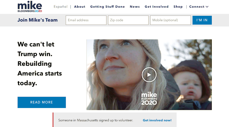
Entering the campaign late didn’t stop Bloomberg from spending a year’s worth of ad money. Former New York Mayor Mike Bloomberg has found a foothold in the Democratic primaries in just over a month. His estimated $77 million in TV ads must have been worth it (by comparison, all the other candidates except Tom Steyer have spent under $5 million in TV ads).
![]()
The Bloomberg campaign’s branding seems like a variant mockup of the Joe Biden’s visuals. The typographic style is very similar, although Bloomberg seems more aware of modern trends with his all lower-case first-name in the logo.
His website also has a much more modern feel than Biden’s, featuring more videos, intuitive navigation and real-time pop-ups.
 Via
Via You can’t fault him for using the same red-white-and-blue color scheme, although in Bloomberg’s defense he minimizes the use of red and relies more on a bright, monochromatic blue palette. As expected from a New York businessperson turned mayor, Bloomberg has a keen eye for graphic design with a Madison Avenue-style logo and website.
His campaign deviates when it comes to content, though. Considering Bloomberg’s journalistic roots, he doesn’t shy away from self-assured, sometimes aggressive language. His brand voice paints him as an expert and born leader offering aid to a struggling America.
Amy Klobuchar
—
Brand colors: Green, white, light blue and dark blueTypography: Reverse-contrast, alternate serifs and sans serifVoice: A capable go-getter with hints of “folky”Slogan: “Amy for America.”
A proud Minnesotan and effective legislator, Amy Klobuchar brands herself as the realistically electable candidate. By appealing to moderates and progressives alike, she promises to be as tough on Trump as she is on her campaign staff!

Toughness is part of her brand identity, and she leans into it without apologies. Like many other candidates, she aims to unite both sides of the political spectrum, and perhaps that explains the mixed bag of her design styles.
Her logo alone displays three different colors in three different fonts, from an elegant, reverse-contrast (alternating thin stems and wide stems) serif to the politician’s choice, a bold and blocky sans-serif. While this metaphorically reflects her brand’s theme of unity among diversity and sets her presidential candidate logo apart from others, aesthetically it’s a bit jarring.
 Via amyklobuchar.com
Klobuchar’s brand voice talks the talk with a tone that’s both assertive and familiar. She draws hard lines on her points and touts pragmatism over idealism, feeding her image as both tough and the most electable.
Her branding, like her platform, compromises when it can but holds the line when it must. Just look at how her logo and color scheme take some risks, but her website and social media content are strictly by the book.
Andrew Yang
—
Brand colors: Blue, white, and… not-quite redTypography: School textbook printVoice: Charismatic EinsteinSlogan: “Make America Think Harder (MATH)”
A “longshot” candidate that exceeded expectations at every turn, Andrew Yang fought hard to earn every member of his Yang Gang. His branding challenges are certainly not enviable. He’s had to both garner publicity for a relative unknown while simultaneously explaining original and unique policy ideas.
![]()
If you already know his central pillar policy, then his branding has done its job. Yang’s branding campaign prioritizes his Freedom Dividend policy, where every American citizen would receive $1,000 per month to stimulate the national economy. In fact, the entire campaign is as much about this one policy as it is the man behind it.
As is clear from his “MATH” slogan, Yang’s entire branding tone has an intellectual air about it, not so much condescending as it is uplifting. In other words, he wants you to know he’s smart and his friends are too, and they all want to use intelligence to help you and the country. Yang spends a lot of time explaining how freedom dividends work, or falling back on his other central talking point, the dangers of automation.
And just in case there’s any doubt about his intellectual prowess, Yang sells branded calculators in his merchandise store.
 Via yang2020.com
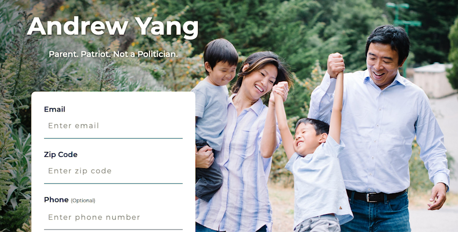 Via yang2020.com
On top of all that, Yang’s brand plays the outsider card, most obvious in his tagline, “Parent. Patriot. Not a politician.” His messaging is quick to bring up his wife and children. While this is an all-too-common approach to politics, it fits Yang’s brand perfectly, considering he started his campaign with the least recognition and political experience of all the Democratic candidates.
Tom Steyer
—
Brand colors: Deep blue, white, and reddish orangeTypography: Bold and blocky, sans serif (**mock surprise**)Voice: Goliath ghost-writing for DavidSlogan: “Actions speak louder than words.”
If Tom Steyer’s branding has one message to voters, it’s this: “Yes, I’m still in the race.”

Fighting for a base of his own, the other billionaire candidate has spent the second most on TV ads, an estimated $69 million. Like Bloomberg, Steyer’s branding message is more about getting his name out there. But Steyer isn’t afraid to stand up for what he believes in, and his branding message is crystal clear on his stances with today’s issues, particularly climate change.
Steyer’s color scheme is reminiscent of the flag, but with a reddish-orange instead of red to stand out. It’s the typography of his logo though that deviates most from tradition—bigger and blockier than the rest and also interconnected in a modern, casual style. You could say the logo is a risk taken by a candidate checking every possible box to get noticed, but it’s a risk that pays off with an effective and memorable presidential candidate logo.
Despite being a billionaire himself, Steyer’s rhetoric tends to attack the wealthy class, at times on the same level as more progressive candidates. He paints himself as a man of the people and cites the fight of “Tom and the People” against “Big Tobacco,” “Big Oil” and “Big Corporations” — the repeated use of the word “big” for his enemies makes him seem “smaller,” like an average Joe type.
 Via tomsteyer.com
But before people care about his policies, they have to know he exists. His branding has a lot on its shoulders. Not only does it have to reflect his political position and appeal to his target segments (like all politicians), it also has to grab him extra attention to bring him to the same level of recognition as his peers.
Donald Trump
—
Brand colors: Red, white, and blueTypography: Bold and blocky, sans serifVoice: Very big claims with very small printSlogan: “Keep America great!”
No matter how the Democratic primary ends up, it’s still just the opening act. The real battle begins when the Democrats put their candidate up against the incumbent Republican president, Donald Trump.

Interestingly, Trump follows some of the same presidential candidate branding styles as the other boomer candidates Biden and Sanders. All three use the same patriotic color scheme with bold, blocky typography (sans serif, sans originality). Even more remarkable is that all of their logos also use flag imagery with stars and/or stripes.
As seen in his tweets, Trump’s own voice is, what’s the word… covfefe? However, his brand voice has a mind of its own, sometimes even contradicting what the candidate says himself. Given Trump’s personal, assertive tone, his branding often seemed tempered and softened by comparison.
Extending on his 2016 campaign, which made the word “populist” part of common vernacular, Trump’s branding likes to portray him as a man of the people, frequently referring to his campaign as a “movement” and touting him as a born-leader.
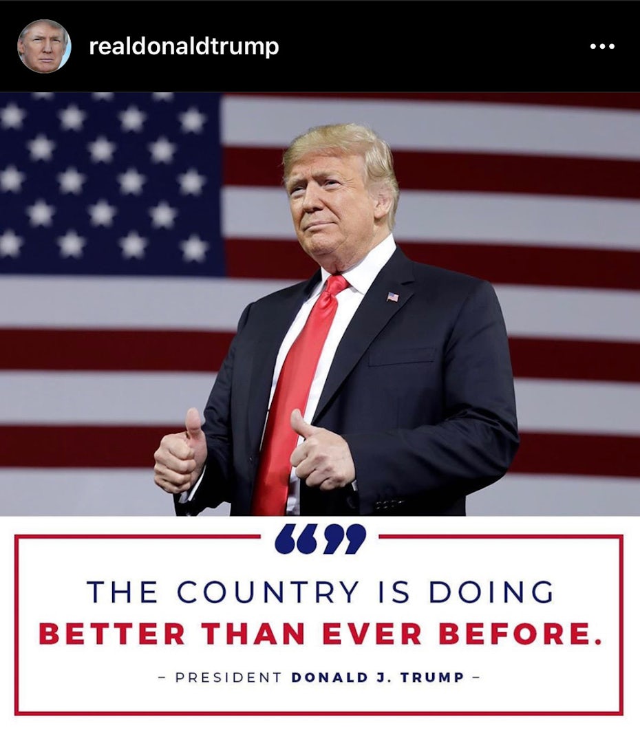 Via @realdonaldtrump
All in all, Trump’s branding is playing a different game than his Democratic challengers. While they’re busy winning over new voters, Trump is feeding his old ones. His branding efforts are meant to validate his base’s support by reaffirming the things they like about him and maintaining the appearance that he’s doing what they want, hence his “Promises Kept” theme.
Visually, the Trump campaign has an eye for grandeur. His pictures often use powerful imagery for backgrounds: helicopters, airplanes and his favorite, large crowds. More low-key images show strength more subtly with pictures of him talking to decorated military generals or foreign officials. The most prevalent visual theme is patriotism with the American flag making frequent appearances.
 Via donaldjtrump.com
From a design perspective, Trump’s branding can come across as superficial or even incomplete, but there’s no denying that it works. For his supporters, a blunt and simplistic approach is just what they want, despite inconsistencies and unoriginality.
Election 2020: May the best brand win!
—
Like business branding, presidential candidate branding is only successful insofar as it reaches its intended audience. It’s hard to judge it using a universal set of standards. While Trump’s 2016 branding was not up to the caliber professional designers prefer, he still won. Perhaps the only real indicator of their branding’s success lies at the ballot box.
Want to learn the secrets of great branding?
Read our ultimate guide to branding.
Read article
The post Analyzing the 2020 presidential candidates’ logos and branding appeared first on 99designs.
Read more: 99designs.com